How to Configure Patient-Facing Vitals Dashboards in a White-Label Platform
A research-backed analysis of white-label patient vitals dashboard configuration, covering data design, usability, alerts, and rollout choices for health platforms.
The hard part of a white label patient vitals dashboard configuration project is usually not the chart library or the color palette. It is deciding what patients should actually see, when they should see it, and how much interpretation belongs in the product versus the care team workflow. As remote monitoring expands beyond device-heavy programs, more health companies are discovering that a patient-facing dashboard is not just a branded front end. It is a clinical communication layer, and bad configuration shows up fast in confusion, drop-off, and support volume.
"User-centred design of patient portals contributes positively to user experience and can make health data easier for patients to understand and act on." — Marthe T. Haverhals and colleagues, Department of Health Services Research and Policy, Australian National University (2025 systematic review)
White label patient vitals dashboard configuration: what teams are really setting up
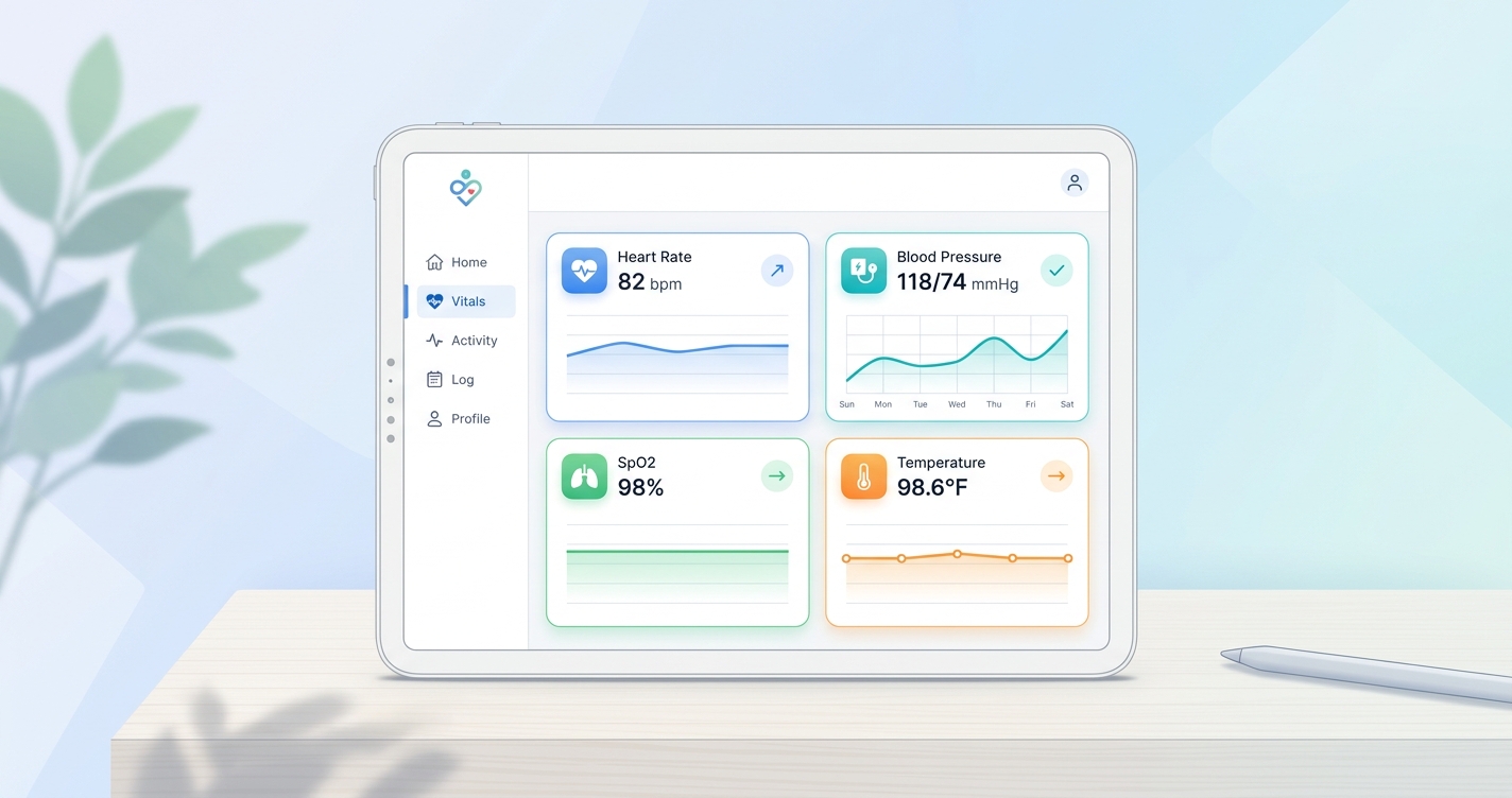
A patient-facing vitals dashboard is not the same thing as the clinician dashboard behind it. The patient version has a narrower job. It should answer a few direct questions: what was measured, whether the reading looks normal for this program, whether the trend is changing, and what the patient should do next if something looks off.
That sounds obvious, but a lot of platform teams still configure patient dashboards as if they were lightweight copies of an internal monitoring console. Patients do not need every raw metric, timestamp, and exception state. They need an interface that reduces ambiguity.
In a white-label deployment, configuration usually spans six layers:
- which vitals appear on the main dashboard
- how trends are shown over time
- what thresholds trigger visual warnings
- what education or next-step messaging sits beside the numbers
- which roles can see household or caregiver views
- how the dashboard fits messaging, appointments, and escalation flows
| Configuration layer | Patient-facing decision | Common options | Why it matters |
|---|---|---|---|
| Vitals selection | Which readings appear first | Heart rate, respiratory rate, SpO2 trend, blood pressure, stress, temperature | Too many metrics create noise; too few remove context |
| Trend display | How change is visualized | 24-hour, 7-day, 30-day trend views | Patients often understand direction better than isolated readings |
| Threshold logic | When the UI changes state | Generic ranges, program-specific thresholds, clinician-set bands | Wrong thresholds create false alarm fatigue |
| Content layer | What explanation appears | Short labels, educational copy, care instructions, FAQs | Interpretation is where patient trust is won or lost |
| Access controls | Who can view or manage data | Patient only, caregiver proxy, family account, care navigator | Proxy access matters in pediatrics, aging care, and chronic disease |
| Escalation workflow | What happens after an outlier | In-app message, nurse review, scheduling prompt, urgent outreach | The dashboard should connect to action, not just display data |
That table is the core design problem. Configuration is really about judgment. The product team is deciding how much complexity to expose and how much to hide.
Why usability matters more than feature count
The evidence base on portals and remote monitoring keeps landing in the same place: more data is not automatically better.
Marthe T. Haverhals and coauthors reviewed 22 studies on patient portal interventions in older adults and found that user-centered design contributed positively to portal use, usability, and usefulness, while clearer design choices improved user experience. Anna Ammenwerth and colleagues, in an updated Journal of Medical Internet Research review of 47 patient portal studies, found favorable evidence for some health outcomes but mixed evidence on efficiency, with privacy concerns and time burden showing up repeatedly as barriers.
I keep coming back to that because dashboard teams often overestimate what patients want from a graph-heavy interface. Most patients are not trying to audit the signal pipeline. They are checking whether their health looks stable and whether they need to do anything.
A 2024 pilot usability study in JMIR Human Factors on contactless vital sign collection in VA video telehealth visits reported that both patients and providers rated the feature as useful and easy to use. That matters for white-label configuration because it suggests the interaction can work in real care settings when the interface stays simple enough.
Good patient-facing configuration usually includes:
- one primary dashboard summary instead of five competing home screens
- plain-language labels for each metric
- visible trend direction, not just current value
- restrained alert states with clear reasons
- a direct path to contact the care team or review next steps
What patient dashboards should show first
The landing state matters more than almost anything else. If the first screen is crowded, patients stop trusting the dashboard before they learn how to use it.
For most white-label health platforms, the strongest first-view configuration includes three blocks:
Current reading summary
This should show the most recent completed readings with simple labels and obvious timestamps. Patients need to know whether they are seeing live data, today's reading, or the last successful session.
Trend context
A line chart or compact trend card helps patients understand movement over time. In a feasibility study published in JMIR Formative Research in 2025, Daniel K. Osei and colleagues described a customizable web dashboard for remote blood pressure monitoring that focused on real-time visualization of trends and alerts. The lesson is practical: trend visualization is useful, but it has to be paired with a clear interpretation model.
Next-step guidance
This is where many dashboards fall apart. A yellow or red badge means very little without context. The product should explain whether the reading is being reviewed, whether the patient should remeasure, or whether someone from the care team will reach out.
| Dashboard element | Best patient-facing configuration | What to avoid |
|---|---|---|
| Home summary card | Latest reading + timestamp + simple status label | Raw numbers with no explanation |
| Trend graph | 7-day or 30-day default with optional drill-down | Dense charts with multiple competing axes |
| Alert state | Short explanation and clear next action | Red warnings with no follow-up instructions |
| Educational content | Contextual microcopy beside the metric | Long generic articles pasted under every reading |
| Historical log | Expandable detail for interested users | Full clinical audit log on the landing screen |
That last point is underrated. Patients who want more detail should be able to find it, but the default experience should not assume everyone wants analyst-level depth.
Industry applications
Telehealth platforms
Telehealth teams usually configure vitals dashboards around visit preparation and post-visit monitoring. The dashboard needs to make readings easy to review before an appointment and easy to revisit afterward. If the platform supports video visits, the vitals dashboard should feel like part of the same product rather than a bolt-on module.
Hospital-at-home and RPM programs
These programs care more about thresholds, outreach, and escalation timing. The patient dashboard has to reassure patients without making them responsible for interpreting every anomaly on their own. A good white-label setup usually pairs patient views with invisible clinician workflow rules in the background.
Chronic condition management
Patients managing hypertension, heart failure, COPD, or multiple conditions often benefit from stable routines and trend visibility. In those programs, consistency matters more than novelty. The dashboard should look the same week after week and make change legible at a glance.
Employer, payer, or wellness platforms
These deployments usually want lighter-touch dashboards with more coaching language and less clinical density. The configuration challenge is keeping the experience useful without implying diagnosis or overmedicalizing routine engagement.
Current research and evidence
The research is not all about white-label software directly, but it says a lot about how patient dashboards should be configured.
In 2025, Marthe T. Haverhals and colleagues published a systematic review in Aging and Health Research that examined patient portal interventions for older adults. They found that user-centered design improved patient experience and supported portal usability and usefulness. For a white-label dashboard team, that argues for configurable language, larger touch targets, and lower visual clutter rather than assuming one default experience works for every population.
Anna Ammenwerth and colleagues, writing in JMIR, reviewed 47 studies of patient portals and found favorable evidence on some outcomes, especially improved monitoring and patient-clinician interaction, while barriers such as privacy concerns and limited time remained common. That is a strong reminder that patient dashboards should reduce effort, not add another administrative task.
The 2024 VA pilot study on contactless vital signs in video telehealth visits also matters here. The study reported strong usability feedback from both patients and providers, suggesting that camera-based vital sign capture can fit telehealth workflows when the experience is straightforward. White-label platforms that bring contactless vitals into a branded dashboard need to keep that simplicity intact rather than burying the measurement inside complex navigation.
A related 2024 paper proposing a Remote Patient Monitoring Usability Impact Model made the same point from a human-factors angle: home-generated physiological data creates usability problems when systems are designed around the device or workflow rather than the person using them. That sounds academic, but it maps directly to dashboard configuration mistakes teams make every day.
| Source | Finding | Configuration takeaway |
|---|---|---|
| Haverhals et al. (2025), Aging and Health Research | Review of 22 studies found user-centered design improved portal usability, use, and usefulness for older adults | Configure for readability, simplicity, and segment-specific needs |
| Ammenwerth et al. (2025), JMIR | Review of 47 studies found favorable evidence for some outcomes and mixed evidence on efficiency; privacy and time remained barriers | Keep dashboards useful without adding extra effort or anxiety |
| VA pilot usability study (2024), JMIR Human Factors | Patients and providers rated contactless vitals in video telehealth as useful and easy to use | White-label flows should preserve a low-friction measurement and review experience |
| Osei et al. (2025), JMIR Formative Research | Remote BP dashboard study focused on real-time visualization of trends and alerts | Trend views work best when paired with clear interpretation and alert logic |
The operational side of configuration
This is the part buyers usually underestimate. Dashboard configuration is not finished when the UI is published.
Teams still need governance for threshold changes, language updates, care-path changes, localization, permissions, and analytics review. If one customer segment wants a wellness-style dashboard and another wants a more clinical RPM view, the platform has to support that variation without creating a support nightmare.
The strongest white-label operating model usually includes:
- tenant-level configuration for branding and copy
- program-level threshold settings with clinical review
- audit logs for configuration changes
- separate patient and clinician view logic
- analytics on engagement, drop-off, and alert response rates
Without that layer, the dashboard may look polished at launch but become difficult to maintain after the first few enterprise customers ask for exceptions.
The future of patient-facing vitals dashboards
I do not think patient dashboards are headed toward maximal data exposure. The better direction is selective clarity.
Over the next two years, I expect more white-label platforms to move toward adaptive dashboards that change by care program, patient role, and monitoring intensity. A post-discharge RPM patient may need prominent alerts and daily trend checks. A wellness user may need a lighter summary with occasional coaching cues. An aging-care deployment may need caregiver access and larger-format summary cards.
That is where white-label configuration becomes more valuable than a hard-coded product. The infrastructure can stay consistent while the patient experience changes by use case.
Frequently asked questions
What is a patient-facing vitals dashboard in a white-label platform?
It is the branded interface patients use to view their health readings, trend data, and related guidance inside a platform that is powered by one company and presented under another company's brand.
Which vital signs should appear first on a patient dashboard?
Usually the answer is the readings most relevant to the program, shown with clear timestamps and trend context. Most platforms work better when the first screen stays selective rather than displaying every possible metric at once.
How are alert thresholds usually configured?
They are typically configured at the program or clinician level, with visual states and next-step messaging tied to those thresholds. The main goal is to reduce false alarm fatigue while still prompting timely follow-up.
Why does usability matter so much in patient vitals dashboards?
Because patients need to understand what they are seeing quickly. If the dashboard feels clinical but confusing, engagement drops and care teams inherit more support work.
If your team is planning a branded patient dashboard and wants to launch without building the entire monitoring stack from scratch, solutions like Circadify Custom Builds can give health companies a white-label foundation for patient-facing vitals experiences.
Related reading on this site: How Telehealth Platforms Add Vitals Without Building In-House, White-Label Health Platform Branding: Customization Options Guide, and What Is Multi-Tenant Architecture? Health Monitoring Platforms Explained.