Why are some new health apps so easy to use, even for my parents?
Why some health apps feel effortless for older users, and how an easy health monitoring app is shaped by white-label design foundations.
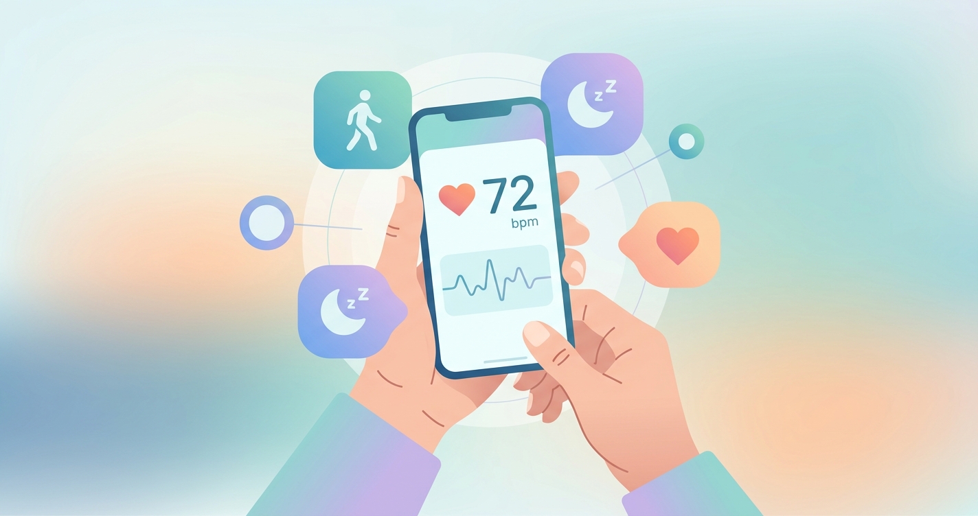
If you have watched a parent or grandparent open a health app, hold their phone steady, and get a heart rate reading without asking for help, you have witnessed something that took years of design work to feel that simple. The reason some products now qualify as an easy health monitoring app is not luck or a single clever screen. It is the result of consumer expectations finally catching up with the tools companies use to build these products, and a quiet shift in how those products get assembled in the first place. Effortless experiences for non-technical users have become a measurable competitive advantage, and the teams shipping them are increasingly starting from a polished, pre-built foundation rather than a blank canvas.
The share of older adults who believe technology supports a healthy life rose from 39% in 2024 to 46% in 2025, while AI use among that group jumped from 18% to 30% over the same period, according to AARP's 2025 Tech Trends survey reported by Becker's Hospital Review.
What actually makes an easy health monitoring app feel easy
When people describe an app as easy, they are usually responding to the absence of friction rather than the presence of features. A 2025 systematic review of age-friendly mobile app design, published in JMIR and covering studies through March 2025, found that the design elements most associated with successful use by older adults were simplified navigation, enlarged text and touch targets, voice interaction, and error-tolerant interfaces. None of those are flashy. They are the unglamorous fundamentals that determine whether a first-time user finishes a task or gives up.
The stakes are high because abandonment is the default outcome, not the exception. A scoping review of digital health app engagement and retention published in JMIR in 2023 found that a large share of downloaded health apps are opened once and never again, with complex onboarding and unclear value cited as leading causes. For a digital health company, every point of confusion in the first session translates directly into lost users and wasted acquisition spend.
What separates a smooth product from a frustrating one tends to come down to a handful of recurring decisions:
- Onboarding that asks for the minimum and explains why each step matters
- A primary action that is obvious within the first three seconds on screen
- Measurement flows that tolerate imperfect conditions instead of failing silently
- Plain-language results rather than raw numbers and clinical jargon
- Accessibility defaults, such as large type and high contrast, that are on from the start rather than buried in settings
A 2024 user-centered study in JMIR Formative Research on a multiprofessional health-habits app for older adults found that adjustments to font size, navigation, and personalization, based on participant feedback, significantly raised satisfaction scores. The lesson was consistent across the literature: small, deliberate refinements compound into the perception of ease.
Build from scratch or build from a base: a comparison
Here is where the answer to the parent question gets practical. Many of the easiest health apps reaching consumers in 2025 and 2026 are not built feature-by-feature from zero. They sit on top of white-label platforms that supply a tested measurement engine and a refined interface layer, which the company then customizes and brands. That decision shapes how usable the final product can realistically be within a normal budget and timeline.
| Dimension | Building from scratch | White-label foundation |
|---|---|---|
| Time to first usable build | 12 to 24 months | Weeks to a few months |
| UX maturity at launch | Early, untested patterns | Pre-refined across prior deployments |
| Accessibility coverage | Added later, often partial | Built into the base components |
| Measurement engine | Must be researched and validated | Provided and maintained |
| Brand control | Full, but slow | Full theming on a stable core |
| Where the team spends effort | Plumbing and primitives | Differentiation and workflow |
| Edge-case handling | Discovered in production | Inherited from existing usage |
The pattern that emerges is straightforward. When a team starts from a mature base, it spends its limited design hours on the parts that make its product distinct and on tailoring flows to its specific audience, instead of rebuilding the foundational interactions that every health app needs. That reallocation of effort is a large part of why newer apps feel more polished to a first-time older user than products from a few years ago did.
Industry applications
Telehealth and remote monitoring
Telehealth platforms have a particular usability problem: their users are often unwell, anxious, or older, and they may be completing a measurement minutes before a video visit. A white-label vitals layer lets these platforms add a contactless reading, such as a camera-based heart rate check using remote photoplethysmography, without inventing the interaction from nothing. The flow arrives already shaped by prior real-world use, which lowers the chance that a stressed patient gets stuck.
Digital health startups
For an early-stage company, engineering time is the scarcest resource. Founders increasingly treat a custom branded vitals app as something to assemble and differentiate rather than to construct end to end. Starting from a white-label foundation means the product looks and behaves like a finished consumer app on day one, which matters enormously when the target user is someone's parent rather than an early adopter comfortable with rough edges.
Hospital and health-system portals
Health-system IT teams face the widest possible user base, including patients with low digital literacy and significant accessibility needs. A platform that ships with enlarged touch targets, high-contrast modes, and tolerant measurement flows already aligned to recognized accessibility practices reduces both support burden and the risk of excluding the patients who most need monitoring.
Current research and evidence
The evidence base for what makes health apps usable by non-technical and older users has grown noticeably. Beyond the 2025 JMIR systematic review on age-friendly design, a March 2025 JAMA study found that most older adults already use digital health technologies, including patient portals, which contradicts the assumption that this group avoids health tech. The barrier is rarely willingness; it is design.
Research on the DigiAdherence app in 2024 reported that older Portuguese adults found it useful, attractive, and user-friendly, and that the experience improved their confidence in managing therapies and preventing falls. A separate 2024 study on collecting health information from older adults via smartphone found that while most participants rated the app easy to use, navigational issues remained the most common complaint, a reminder that even good products leave usability gains on the table.
Taken together, the literature points to a consistent conclusion. Usability is not a finishing touch applied at the end. It is a set of decisions baked into the foundation, and products that inherit a well-tested foundation start much further ahead. That is the structural reason an easy health monitoring app feels effortless to a parent who would have struggled with the same category of product a few years earlier.
The future of easy health monitoring apps
Three shifts are likely to define the next phase. First, contactless measurement will reduce friction further by removing the need for extra hardware, letting a phone camera handle readings that once required a clip or cuff. Second, voice and conversational interfaces, already flagged in the 2025 age-friendly review, will lower the literacy and dexterity demands of health tasks. Third, accessibility will move from a compliance checkbox to a default expectation, partly because the user base is aging and partly because regulators and buyers are demanding it.
The common thread is that the bar for ease keeps rising while the appetite to build everything in-house keeps falling. Companies that want to meet rising expectations without multi-year timelines will lean more heavily on customizable, pre-refined foundations and reserve their own effort for the experience details that set them apart.
Frequently asked questions
Why do some health apps feel so much easier than others?
Ease usually reflects deliberate design choices, including simple onboarding, an obvious primary action, large readable text, and forgiving measurement flows. Apps built on a mature, pre-refined foundation tend to inherit these patterns, so they feel polished from the first session rather than after years of iteration.
Are health apps actually usable for older adults?
Yes, increasingly so. A March 2025 JAMA study found that most older adults already use digital health technologies. The main barrier is design quality, not willingness, which is why accessibility defaults like enlarged text and high contrast make such a noticeable difference.
Does a white-label platform mean every app looks the same?
No. A white-label foundation provides the tested engine and core interactions, but the company controls branding, theming, and workflow. Two products built on the same base can look and feel entirely distinct while both benefiting from the same proven usability groundwork.
What is contactless vitals measurement?
It is a technique, often called remote photoplethysmography or rPPG, that reads signals such as heart rate from a phone camera without a wearable or clip. Removing extra hardware is one of the most direct ways to make a health app easier for non-technical users.
Circadify is addressing exactly this space, providing a fully white-labeled contactless vitals engine that lets health companies launch user-friendly, on-brand monitoring experiences without building the hard parts from scratch. Teams exploring a custom build can start a partnership inquiry at circadify.com/custom-builds.